Creative packaging makes food look more delicious! In addition to taste, whether customers will buy food or not, packaging design often plays a decisive role! In fact, many people who buy this product may not care about the taste but just want to buy it because of the beautiful packaging! Buy it! Buy it! There are always some excellent food packaging design ideas that make consumers move. Take a look, and we have collected 15 outstanding creative food packaging design cases. From chocolate, honey, snacks, pasta to soft drinks to spices, all food packaging breaks the norm and is highly innovative!
creative chocolate packaging design
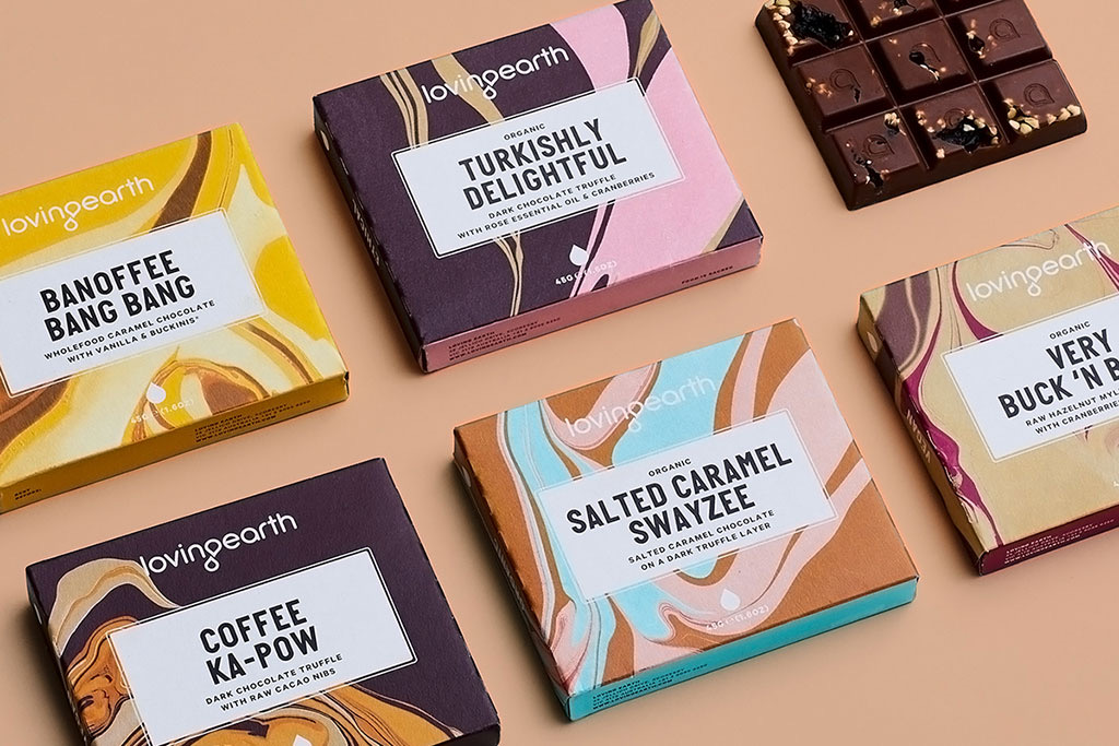
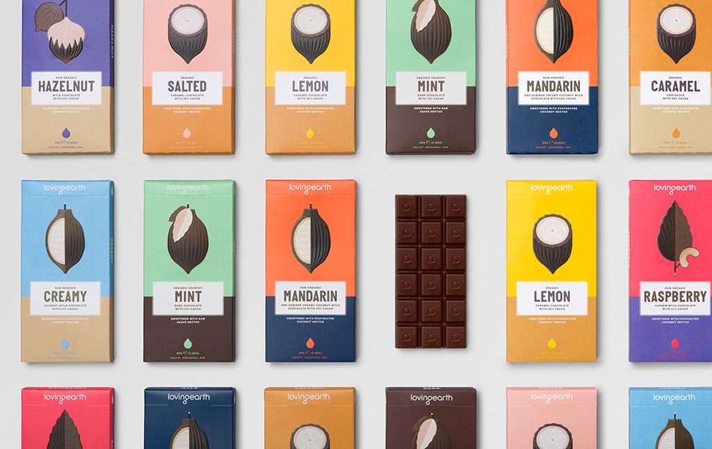
Loving Earth Chocolate Packaging
Simplicity is the keyword of Loving Earth’s chocolate packaging. You can see that the entire packaging is very simple, from font to design. Two colors are used as the base, and the font is printed in the blank part of the middle. The top of the package is printed with either cut or peeled or whole cocoa beans, which is its entire design.
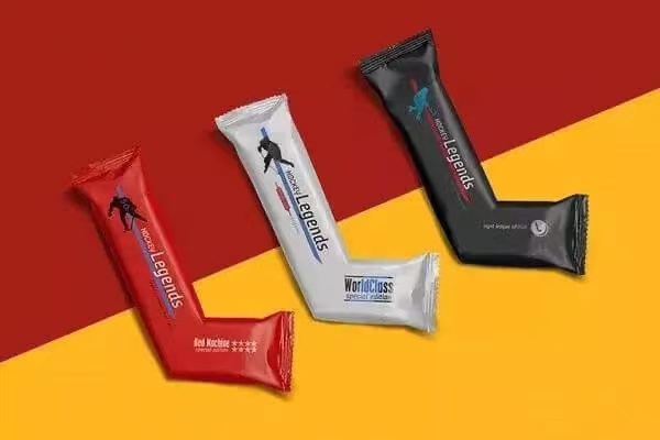
Hockey Legend Chocolate Packaging
creative pasta packaging
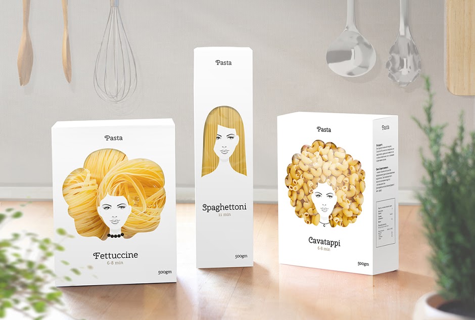
Pasta packaging
Are you shocked? Moscow designer Nikita Konkin designed this creative food packaging for pasta. In this way, the pasta in the package looks like the hair of a cover girl. The creative pasta packaging series also includes feminine patterns with wavy hair (fettuccine) and straight hair (spaghettoni). The packaging design focuses on the hair and uses the style of Italian girls to show the charm of pasta.
creative honey packaging
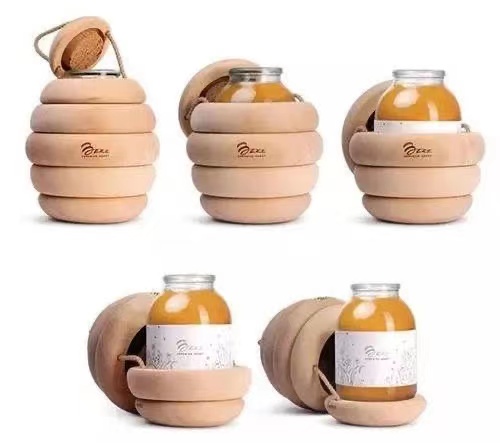
Buzz honey packaging
The design of Backbone Studio is mind-boggling. He added a wooden circle to the glass bottle containing honey and then stacked the two ends on the ground in the middle. It feels like honeycomb-like building blocks. The point is that you can open each layer~ It looks like the favorite hornet’s nest of the Pooh, or a mine bomb, or a cicada pupa…? Ingeniously, the wooden circle does not Glue together, connected only by rope. When you open this honey package, it will feel like a silky cocoon. This creative honey packaging design comes from Armenia. It is an improvisation of the designer and cannot be purchased in supermarkets.
creative nuts packaging
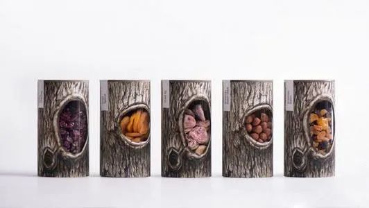
Pchak dried fruit packaging
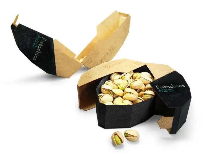
Pistachio packaging
This seems like a good idea. Inspired by the shape of the pistachio, American designer Maija Rozenfelde simply made the shape of the outer packaging into giant pistachio. When you open the box, it’s like peeling pistachio. You can close it perfectly if you can’t finish it to preserve the freshness of the food. This creative nut packaging also won the 2014 Red Dot Award.
creative snack packaging
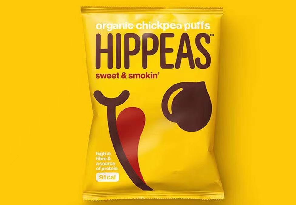
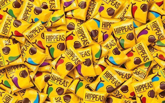
HIPPEAS potato chips packaging
Creative wafer packaging
Take a look at this cute snack packaging. The visual image of the packaging reflects its playful attitude related to flavor. Very interesting, each flavor has a concise name for the superior taste. And the pattern is balanced with a colorful palette and a clean layout. The designer used illustrative repeating patterns full of candy-like feeling throughout the brand’s packaging design process. It is easy to attract the attention of consumers.
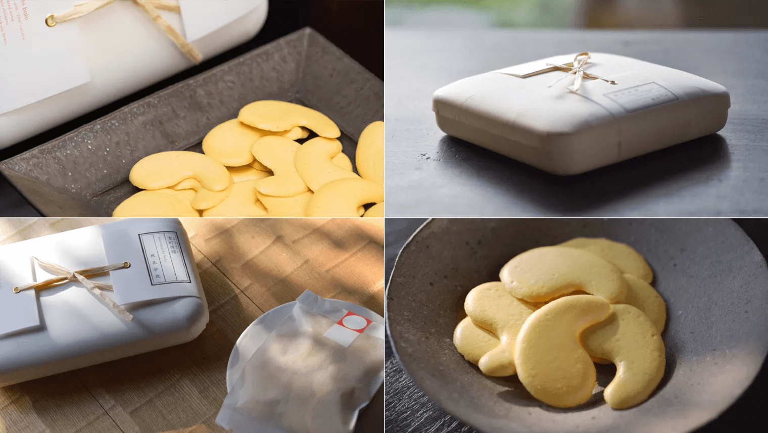
MUROMACHI BOLO Egg Biscuit Packaging
creative takeaway packaging
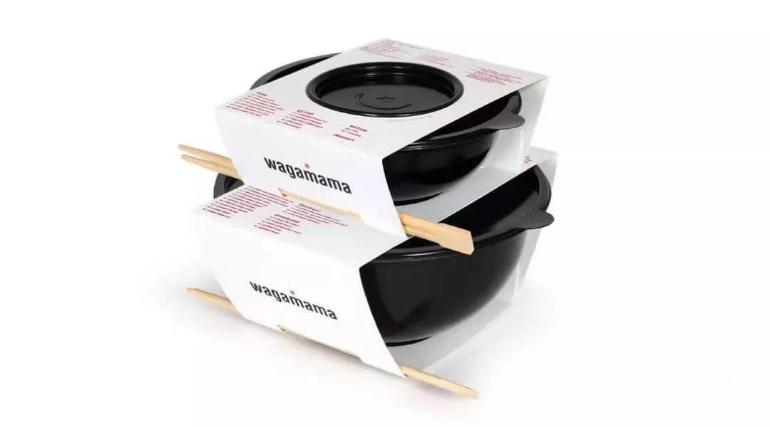
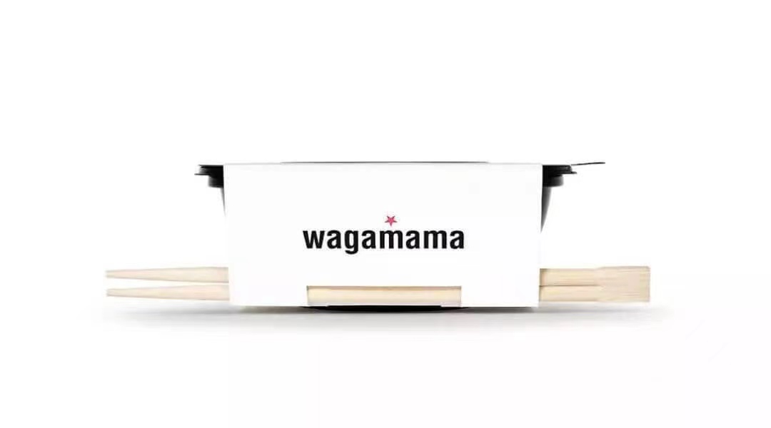
Takeaway bowl packaging
Designing the takeaway into a bowl is also very customer-conscious and courageous. Because of the bowl, it is easy for people to forget about the takeaway, just like eating at home. But it is essential to know that bowl-shaped take-out boxes are not easy to stack and pack. But don’t worry, the designer has solved this problem. And they use the principle of superposition of sizes and superpositions of the same type, make soup and rice are separated. While it is convenient to eat, the same color design of the juice bottle also enhances the sense of luxury.
creative drink packaging
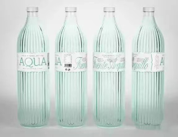
AQUA water bottle packaging
The bottle design of this Italian water is great, inspired by the Coca-Cola bottle. This straight-sided bottle with a spherical neck was once called the “Hutchinson bottle.” I like the stripes on the bottle body. Putting the stripes in the water bottle packaging gives people a different feeling. The bottle design has a certain sense of beauty, and it is not inferior even if it is placed with other wines in the showcase in the bar. The designer adopts the design technique that combines the past and the future, which reflects the fearless rebirth of new products and easily evokes consumers’ nostalgia and resonance!
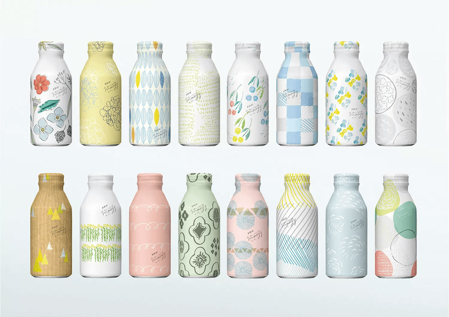
MOOGY Ginger Barley Tea
Unlike most beverages, Kirin’s moogy ginger barley tea has only one flavor, and it only supports online sales. So there is no product information on drink packaging. However, all the relevant content can be found in the online purchase. Because of this particular sales method, bottle packaging has become a place to make a big fuss. The packaging is changed every spring and winter. Each bottle has a unique hand-painted textile-style pattern to match the mood or clothing to increase the happiness of “drinking.” Therefore, there are already dozens of packaging designs.
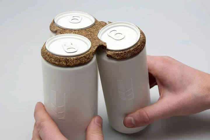
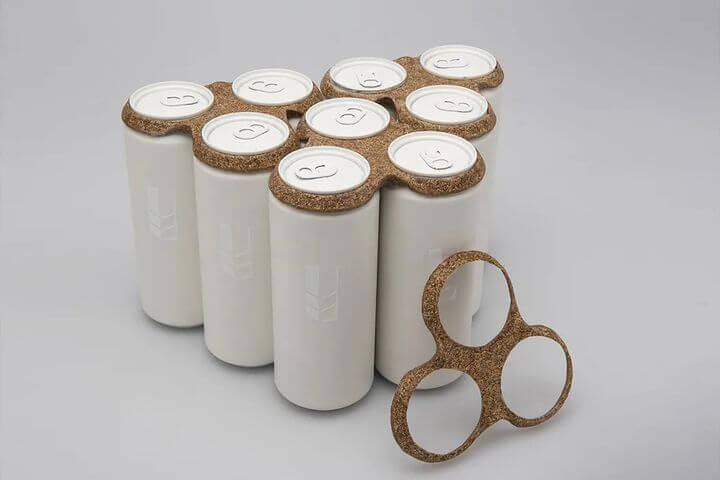
Maberical beer packaging
Who would have thought that the paper-plastic beer bag would be replaced by a 100% degradable packaging material one day? Naturally carved and decorated, the milky white bottle is matched with a new gray material packaging. Compared with another paper-plastic beer packaging on the same shelf, it is straightforward but not simple. It highlights the product and shows a higher grade. And this 100% material that can replace paper and plastic packaging has a wide range of applications, such as coasters, dinner plates, artworks, handbags, and other packaging or event props. I have to say that the designer also gave new meaning to drinking behavior when designing this beer packaging!
creative rice packaging
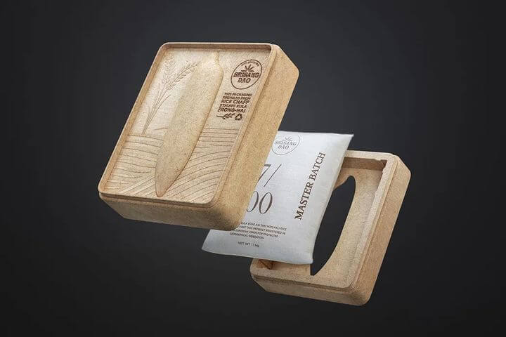
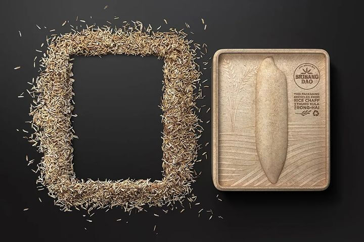
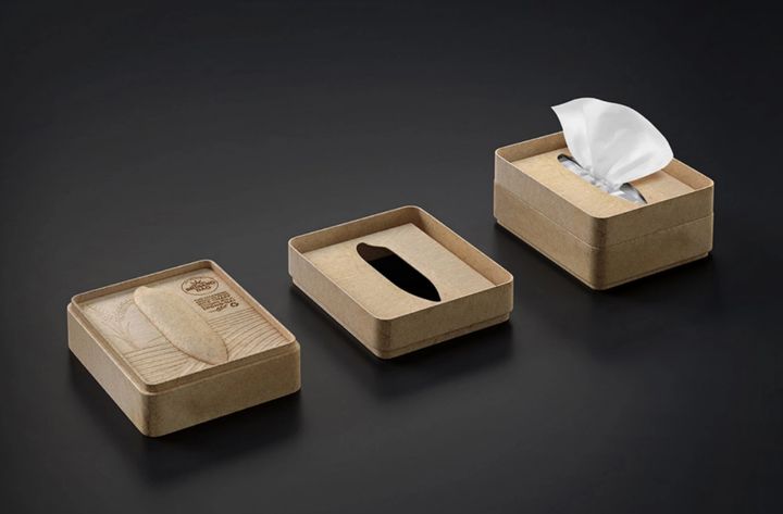
Excellent food packaging designers are always able to “reuse waste” and bring forth the new. This is the packaging made by chaffs, which is natural waste from the shell, and it incorporates the designer’s tribute to the difficult grain production. We can see a big relief of rice grains in the middle of the box surface, which is the main artistic element. On this basis, the texture pattern symbolizes the vast wheat field with wavy lines, allowing consumers to be immersed in a picture full of rice fragrance. Considering that one thing has multiple uses and storing rice, the designer also gave it the function of a tissue box.
creative spices packaging design
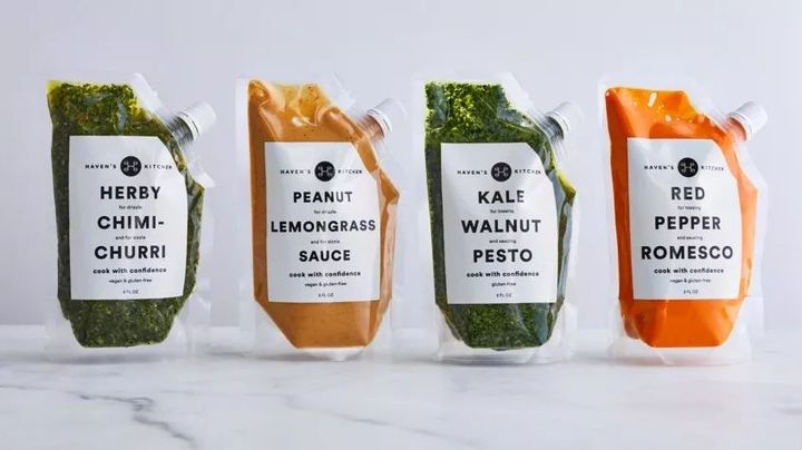
New York designer Alexandra Stikeleather adopted a back-to-basics approach when designing simple spices packaging for her client Haven’s Kitchen Sauces. She stated that the brand “is all kinds of fresh ingredients that need to be cooked with care. They want the packaging to express the concept that what you see is what you get without any tricks. The font is simple and clean, and the sauce is as bright as a palette.” Although Haven’s design may be practical in nature, its plastic packaging also reflects futurism in its functionality.